How Reverse Tuck End Boxes Work
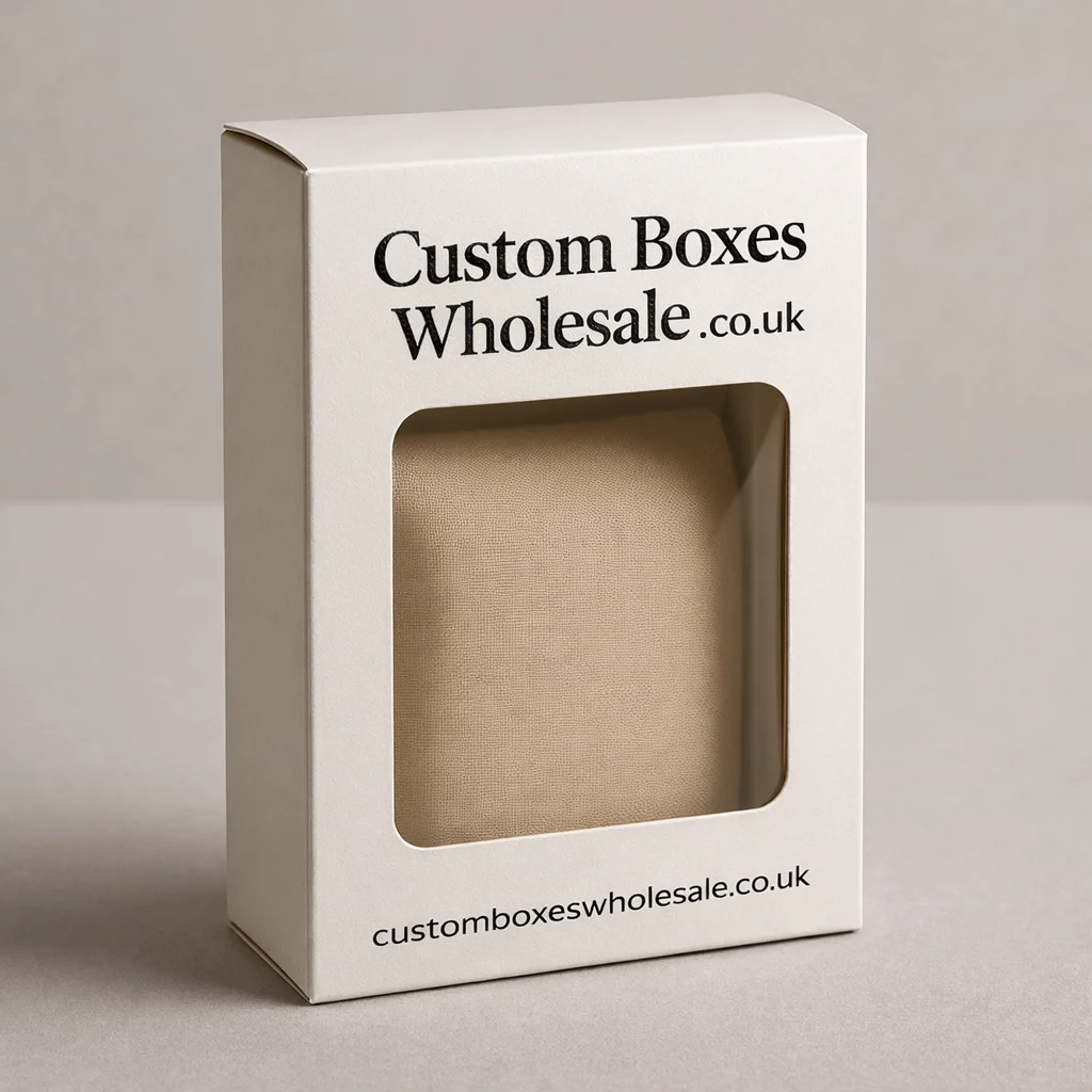
A reverse tuck end is a one-piece folding carton with tuck closures at both ends. What makes it different is the direction of those closures: the top flap and bottom flap tuck from opposite panels rather than following the same direction.
That simple structural difference makes the reverse tuck end box useful for many lightweight retail products where the carton needs to arrive flat, fold into shape efficiently and remain easy to open during normal use.
Side or dust flaps sit behind the main tuck panels to help keep the contents enclosed. The exact flap dimensions, board grade and internal size should still be matched to the product rather than relying on the box style alone.
If you are still comparing structures, our range of box styles and packaging templates shows alternatives built around different closing, display and support requirements.
A Practical Carton for Everyday Retail Products
Reverse tuck end cartons are commonly associated with compact products that do not require a reinforced shipping box or a heavy-duty base. Typical applications can include:
- cosmetics and personal-care products
- small bottles and tubes
- soaps and toiletries
- stationery
- lightweight accessories
- small electronics accessories
- dry retail goods
- promotional products
For shelf-based products, the rectangular panels provide useful space for product names, instructions, branding and other required pack information. Beauty brands in particular can use this structure alongside other custom cosmetic packaging formats where individual products need compact secondary packaging. For a broader range of shelf-ready applications, compare it with other retail packaging boxes before deciding which closure best matches the way your product will be displayed and handled.
Size the Carton Around the Product, Not a Stock Box
The correct internal dimensions are more important than simply choosing a reverse tuck end box template and scaling it up or down. Too much unused space can let the product move inside the carton. An overly tight fit can place unnecessary pressure on the panels or make the tuck flaps difficult to close.
Useful measurements normally start with the packed product itself. Its width, depth and height determine the internal carton dimensions, while the board thickness, closure allowance and any insert affect the final reverse tuck end box dieline. Products with unusual caps, pumps, lids or projecting components may also need extra clearance even when their main body dimensions appear straightforward. This is why the reverse tuck end box template should be treated as the structural starting point rather than a universal finished size.
Match the Board to Weight and Presentation
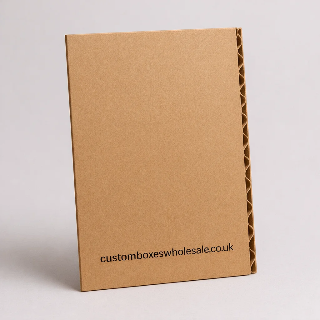
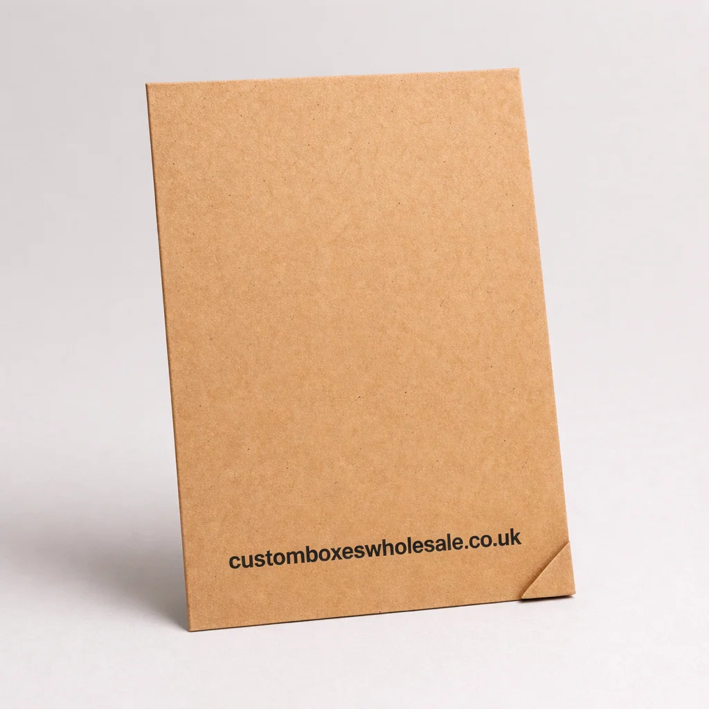
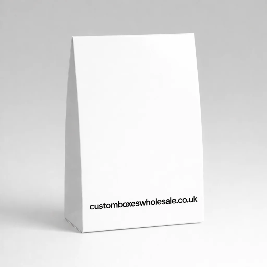
The phrase reverse tuck end describes the closure style, not the strength of the board. For many lightweight retail applications, paperboard or cartonboard is the natural starting point. White board offers a clean printing surface for detailed graphics and brighter colour reproduction, while kraft can support a more understated visual direction.
Searches for white reverse tuck end cardboard boxes often refer to this general type of white retail carton, although the actual board specification should be chosen around the product, dimensions and required finish. Thicker board does not automatically solve every structural problem either. If the product is relatively heavy, needs stronger bottom support or will experience more demanding handling, another construction may be more appropriate.
Plan the Dieline Before Finalising Artwork
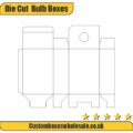
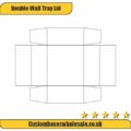
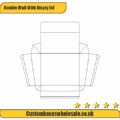
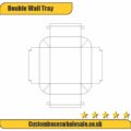
A reverse tuck end box dieline maps the carton while it is still flat. It identifies the main panels, tuck flaps, dust flaps, glue area, cut lines and fold lines that eventually create the finished structure. Artwork should be positioned around this layout rather than designed as though every panel were a separate rectangle.
Important elements such as logos, product names and instructions should remain clear of fold lines and areas hidden when the carton is assembled. Panel orientation also deserves attention because the top and bottom flaps close from opposite sides. A well-planned dieline helps ensure the printed carton looks intentional once folded rather than only looking correct on a flat artwork file.
Use Printing to Support the Product Hierarchy
A printed reverse tuck end carton gives brands several usable exterior panels without turning the structure itself into the main attraction. The front panel can carry the primary product identity, while side and rear panels can hold supporting information, instructions, ingredients or other details relevant to the product.
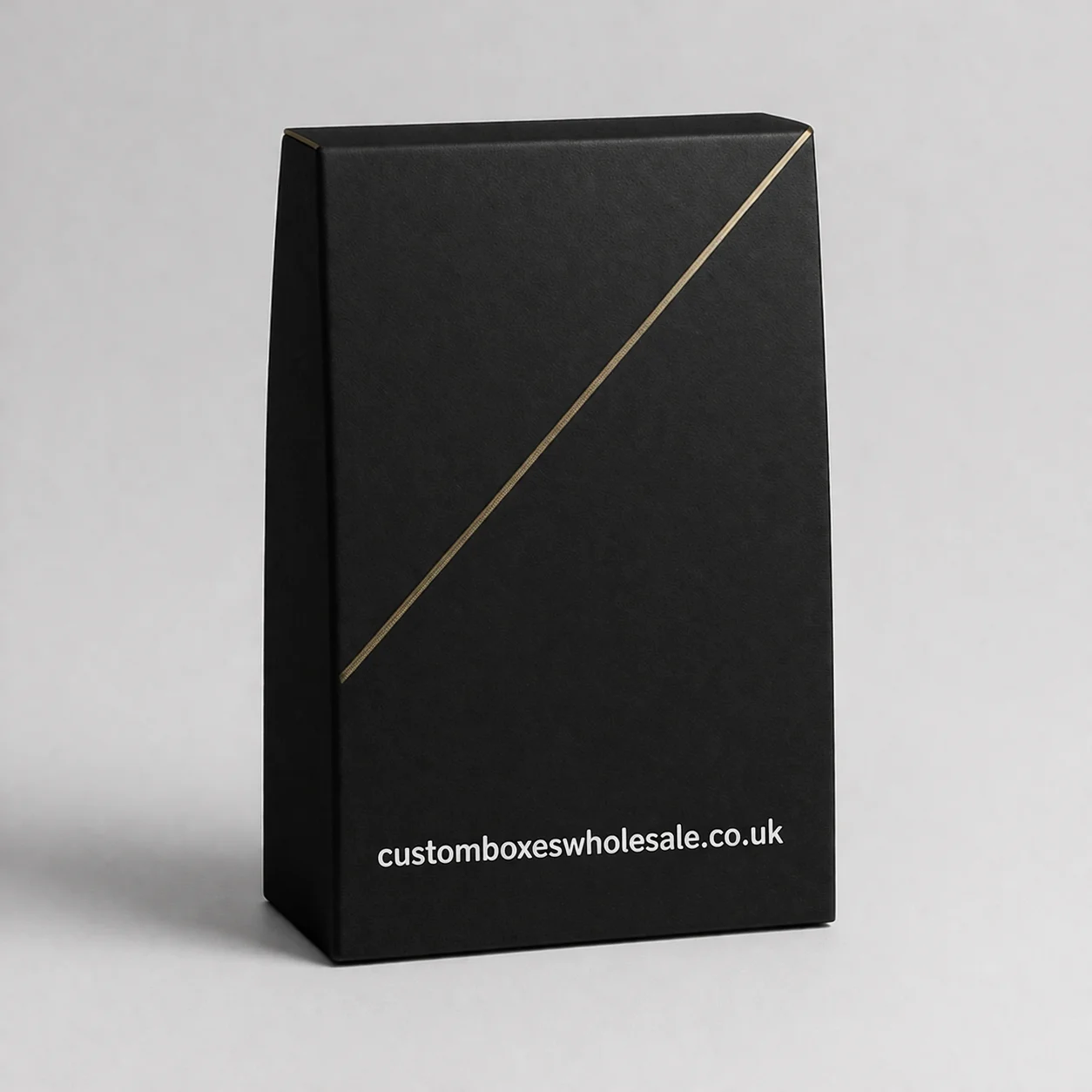
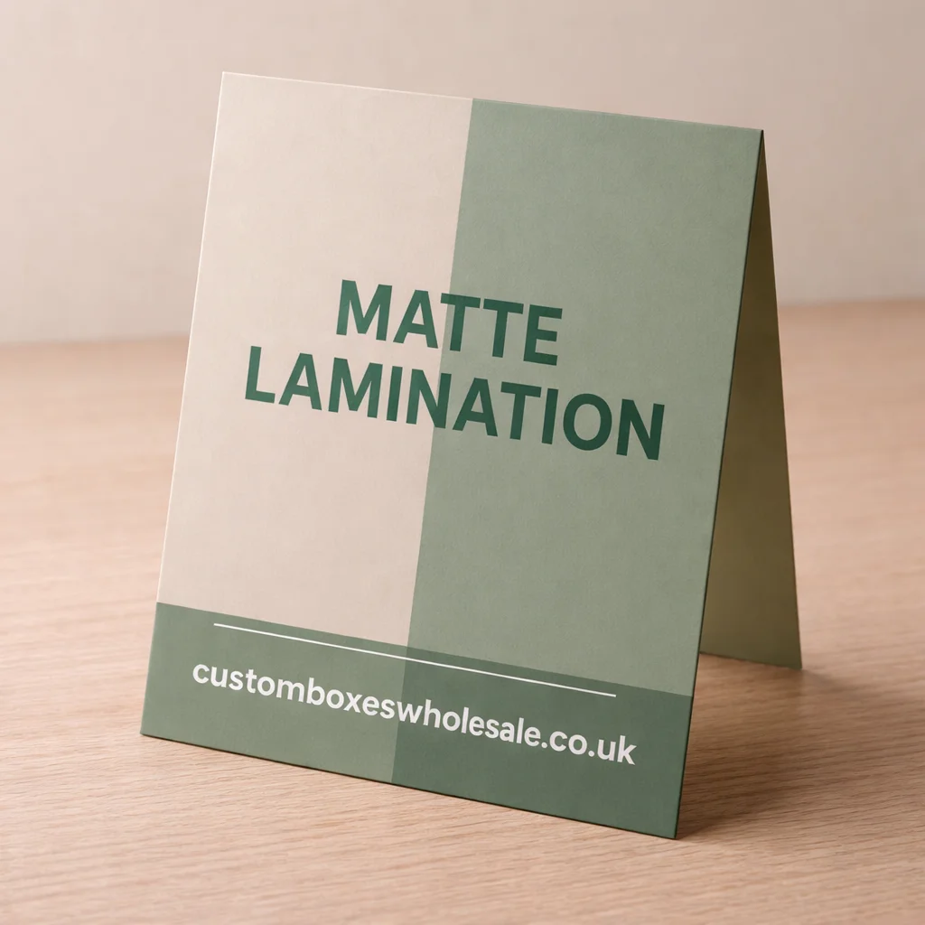
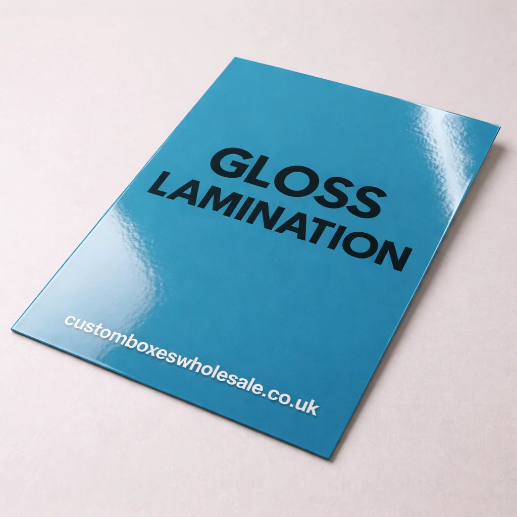
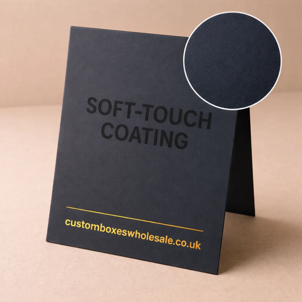
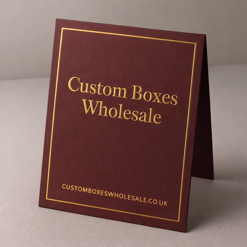
Full-colour artwork can be used when photography, illustrations or multiple brand colours are required. Simpler artwork may rely on one or two strong colours with more open space. Finishes such as matte or gloss lamination, foil details, embossing or selective gloss can be considered where they contribute to the intended presentation. The right combination depends on board choice, artwork and how premium the finished pack needs to feel.
The goal should be to make the custom reverse tuck end boxes easier to recognise and understand, rather than adding every available finish to the same carton.
Reverse Tuck End vs More Secure Closure Styles
Reverse tuck end RTE boxes work well when convenient opening and a straightforward folding-carton format are priorities. They are not automatically the best option for every product. A product that needs the ends permanently closed may be better suited to seal end boxes, where the closure approach is different from a reusable tuck end.
If the product needs a stronger front structure or more support than a conventional folding carton provides, double wall tuck front boxes are another structure worth comparing. Choosing between them should come down to product weight, access, packing method, display requirements and the level of support needed after the carton is assembled.
Reverse Tuck End Cartons Are Not Mailer Boxes
The search phrase reverse tuck end mailer boxes can create confusion because the two structures serve different packaging roles. A reverse tuck end carton is generally a lightweight folding carton with opposing tuck closures. A mailer normally uses a different construction designed around a hinged lid and more substantial shipping or ecommerce handling.
If the pack itself needs to do the job of an outer delivery box, explore custom mailer boxes rather than assuming that making an RTE carton thicker will produce the same result. An RTE carton can, of course, be placed inside an outer shipping carton or mailer when the product needs both branded retail packaging and additional transit protection.
Build the Reverse Tuck End Style Around Real Use
The best reverse tuck end carton starts with a few practical questions: What is going inside it? How heavy is the product? How closely should it fit? Will customers repeatedly open the carton? Is it being sold from a shelf, packed into an ecommerce order or placed inside another shipping box?
Those answers determine whether the reverse tuck end style is suitable before decisions about artwork and finishes are made. Once the structure fits the job, dimensions, board choice, printing and finishing can be developed around the product rather than forcing the product into a generic carton.